Redradar
MY ROLE
UI/UX design / Interface design / Mobile design
YEAR
2014
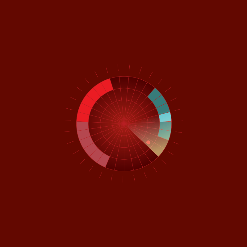
RedRadar is the first menstrual calendar app designed for both men and women. A standout feature of this app is its ability to manage multiple profiles simultaneously. The core design motif is a radar that tracks fertile days, ovulation, PMS, and menstruation.
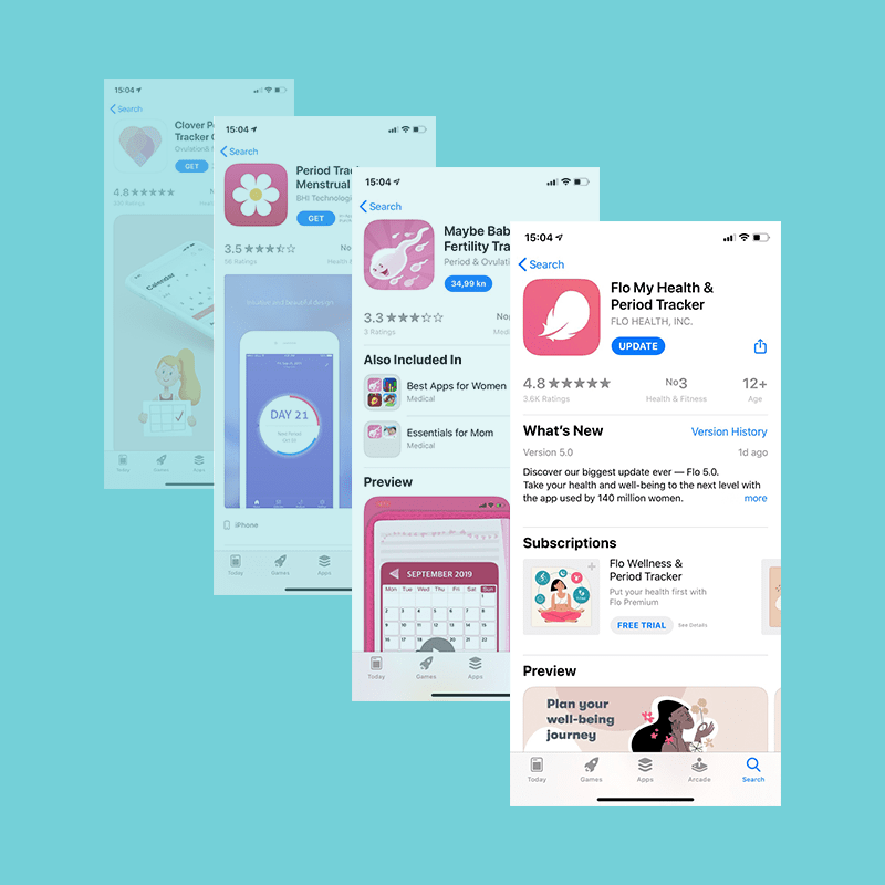
competition analysis
While many menstrual apps use pink tones, I chose to use a color rarely seen outside the wine industry—red, which directly evokes the concept of blood. This choice creates a clear and straightforward visual association.
Symbol
The radar’s focus on tracking the "egg cell" in the cycle inspired the name "RedRadar." The military-style radar symbol adds an element of intrigue and animation, potentially appealing to the male audience for whom the app is also designed.